There's so much a poster can do.
No matter how much you like the maker and the stars, a lame one-sheet makes you cringe, and your buzz begins to wane. On the other hand, a film and creators you've never heard of might have a poster that makes you instantly curious.
Some click, some don't -- and a good poster doesn't a good film make. And vice versa.
That in mind, check out my favourite posters of 2009:
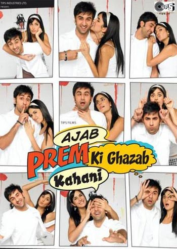
Ajab Prem Ki Ghazab Kahani
Sure we have nine shots of Ranbir Kapoor and Katrina Kaif in the poster, but they're looking (mostly) far from conventional screen lovers, goofing off in a range of candids that end up looking like a comic book made out of polaroids. Neat.
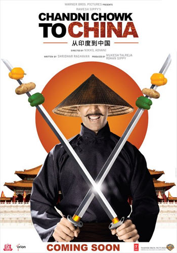
Akshay Kumar has frequently gone on record to say that he signed this film based on the poster, and while that isn't the most sound school of thought (see review), it sure is a terrific poster, featuring a chef too swashbuckling to be true.

Much was made of the poster with Abhay Deol and the big lips, but it was way too overdone and shock value really isn't everything, even on a poster.
This wine-red stunner, on the other hand, featuring him with Mahie Gill, is both sensual and surreal and instantly intriguing.
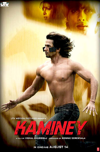
Women around the country have gone on and on about this poster, drooling at the sight of a sprinting Shahid Kapoor, buff as the horse you can vaguely see next to him.
And what makes the Shahid gallop truly striking are the blinkers he's wearing around his intense eyes. No distractions.

Women around the country have gone on and on about this poster, drooling at the sight of a sprinting Shahid Kapoor, buff as the horse you can vaguely see next to him.
And what makes the Shahid gallop truly striking are the blinkers he's wearing around his intense eyes. No distractions.
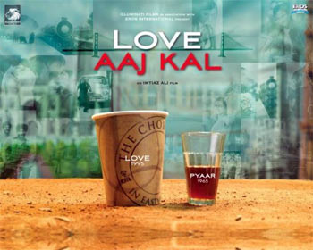
Looking initially like a coffee advert, there's a lot that's wrong with this poster: For one, it makes a cutting chai glass seem dated, and assumes that Love is a more modern word than Pyaar.
Still, the poster catches the eye, and its not everyday that a film starring two major stars doesn't show off a proper glimpse of them.
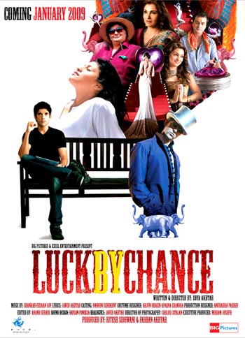
It's the sight of Hrithik Roshan in that absurd silver top hat, really. Farhan Akhtar sits, in black on a black bench, looking slightly scared as we can see the Bollywood circus spilling out behind him.
There's glitz and colour -- no coincidence that Konkona Sen Sharma wears white to his black -- and there's whimsy, via Hrithik and the elephants. Interesting, without question.
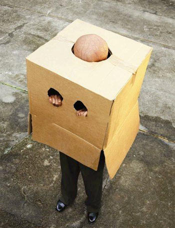
Let's not go into the father-son-father-son space that the posters later showed, but the first long-awaited glimpse we had of Paa came with these two teaser posters, the first showing two feet sticking out of a brown cardboard box -- don't miss the schoolboy shoes -- and the second has two holes for hands (somewhat let down by the visible hands in the first shot, though) and one for the head, a bald, veiny one.
We're instantly intrigued.
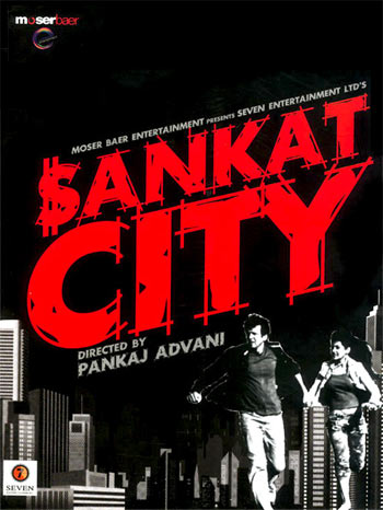
Did you ever really imagine the film's makers wouldn't go into the Sin City colours?
This one's a killer poster, right from the dollar sign on the Sankat S to the photocopy-fade given to the prtagonists running in front of a boxily sketched skyline. And black and scarlet always work.
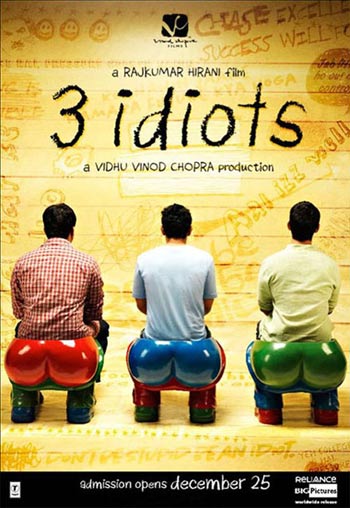
Three heroes, three a**** -- really, was there a better way to live up to the film's title?
Rajkumar Hirani got these buttock-shaped stools especially made for his film, and then seated his heroes in such a way that we know who's who just by haircuts and posture. And such nice colours.